Mister C., the patron saint of Greek bookbinders, is at it again!
Some time ago he brought me this two-volume set. The first volume was falling apart and needed a full rebind, whereas the second volume had a detached board and wear on the spine’s leather, but was otherwise in a good condition. A simple job, if commissioned by any other client…
Volume 2
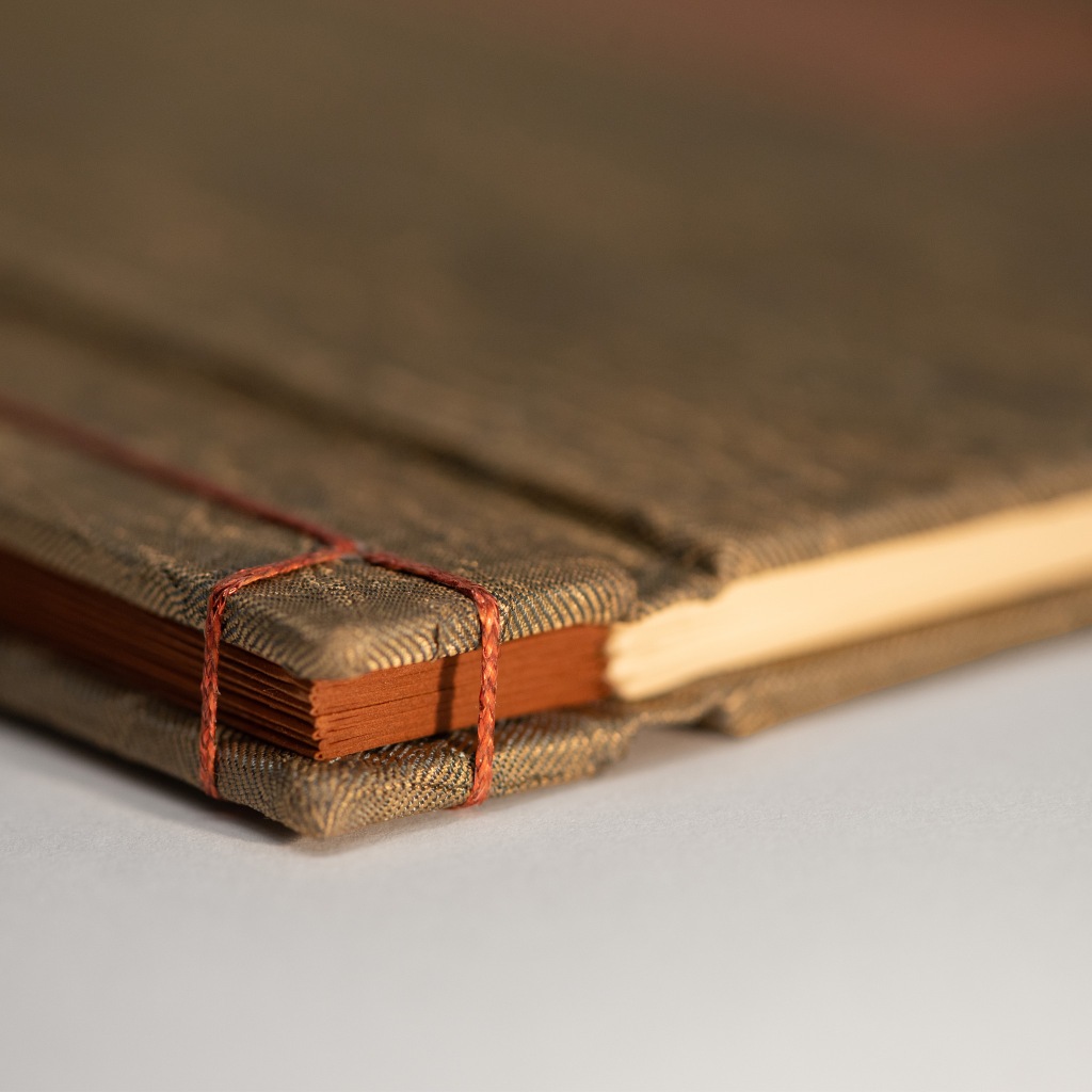
As evident by Lafcadio’s Hearnbinding, Mister C. has an appreciation for the Japanese history and culture. As such, he wanted the repairs on volume 2 to be reminiscent of Kintsugiand also along the lines of Kathy Abbott’s striking restorations in Tomorrow’s Past imaginative spirit, who has graciously given me permission to share the finished bindings.
In order to do this, I needed the assistance of a conservator to lift the binding’s leather, clean and prepare the areas underneath, and then reattach everything once I had worked in the golden leather inserts.
It sounds much simpler than it actually was, as the spine was crumbling in places, could only be lifted in part and so could the leather on the boards. This meant the leather additions had to be rather irregular in shape, with odd paring here and there, and attaching them required a lot of back and forth between me and the conservator.
I initially worked with Eleni Tsetsekou, who did a great job. However, in the time the binding sat finished at my bindery until I got to work on the other volume, I grew displeased with the gold leather I had chosen and so I decided to re-do the whole thing with a different one. This time I worked with Alexandra Malliou, who was also very thorough and helpful.
I also made a book-shoe, a simple open case made of thick paper that has a lip to assist in pulling the book out of the shelf, which reduces wear when the binding is taken from or returned to the shelf.
Volume 1
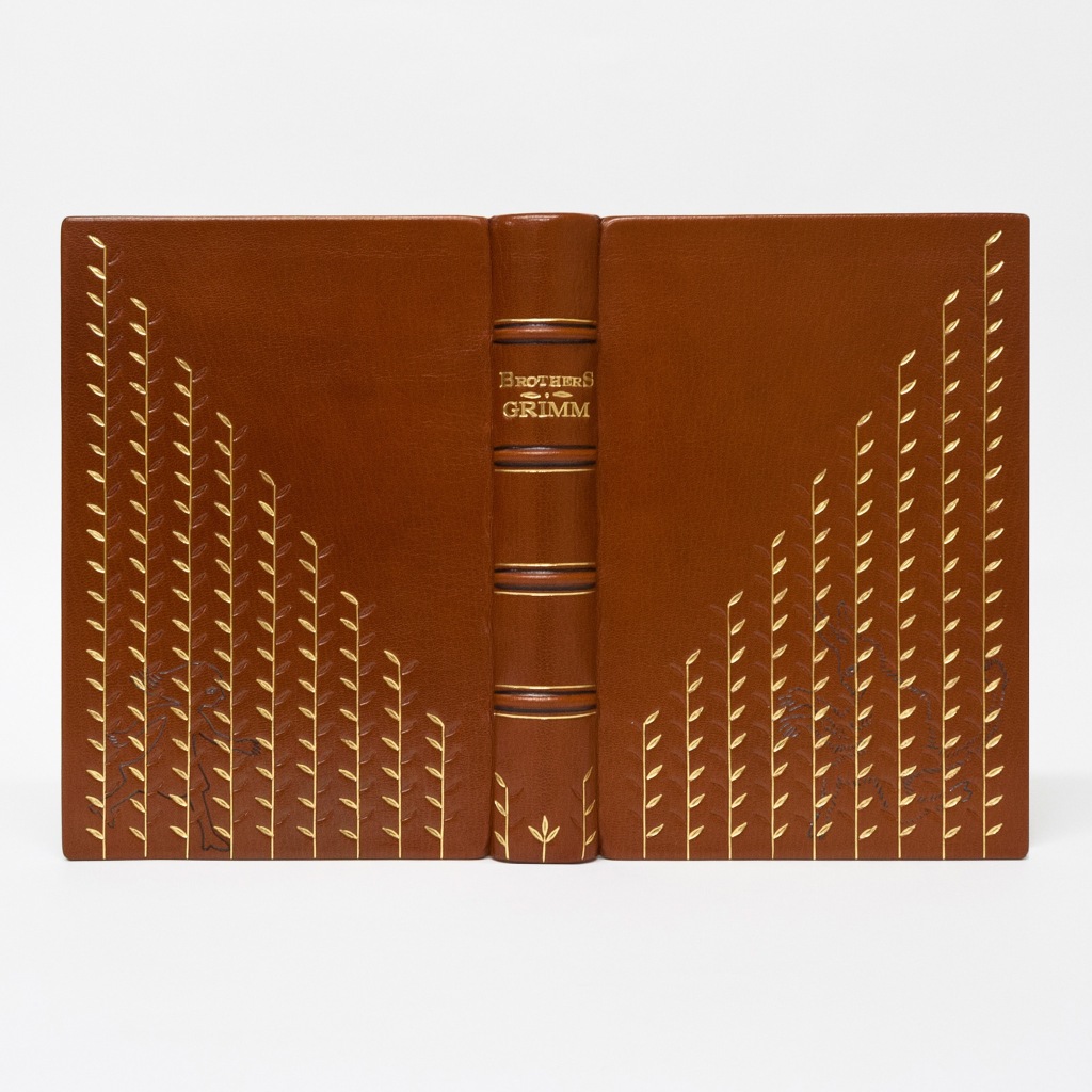
The first book of the set was bound much later, hence the sequence in this post. Mister C. is always looking for ways to add a playful note to his projects and this was no exception. He suggested that instead of trying to make the new binding’s spine identical to the original it should have a “transitional” character, as if there is a change/dialogue taking place between the two volumes but you’d need both next to each other to realize it.
His idea led to this rather irreverent decoration! I tried to imitate the decorative elements of the original binding as best as I could with the tools I had available. Each panel, with the title being the only exception, is misbehaving in some way: upside down flowers, scattered and out of line details that eventually fall into place, leading to the orderly second volume’s spine.
Always a pleasure to work with Maria Siorba, who did the photo-shoot and editing.
My Polishing tool is made to a convenient size (roughly 3x2x2) for use on the covers, narrow spaces between spine bands and other details that require control and finesse such as coif or the covers’ edges.
It’s also made of brass, which won’t rust or stain your leather, and polished to a mirror finish.
A polishing tool can be used for:
– Crushing the grain in preparation for tooling
– Polishing the leather to add a pleasant sheen or achieve an aged look
– Certain decorative techniques, f.e. surface gilding or waxing
How do I order? a) Just sent me an email in the address at the top of the right column of my blog or leave a comment here. (Support small businesses by shopping directly from them!) b) Or head over to my Etsy shop.
This is a collection of 6 short stories from Lafcadio Hearn.
Hearn was an Irish-Greek-Japanese writer, translator and teacher, who lived during the 2nd half of the 19th century and introduced Japan’s culture and literature to the West. Upon arriving there he fell in love with the land, its people, its customs and legends, so much so that he spent the rest of his life there, married a Japanese woman, was granted citizenship and assumed a Japanese name.
His anthologies are populated with personal thoughts and experiences, written in a heartfelt way and full of appreciation for a culture that was largely unknown to the west world. If you enjoy reading folk tales and/or have an interest in Japanese culture then I couldn’t recommend him more.
Mister C., the ever-patient patron saint of Athenian bookbinders and owner of the book, made two suggestions. The first one was to do a Japanese stab binding. The second one was to create some kind of “seal” that would prevent the book from being opened, unless it is removed, protecting the reader from unintentionally releasing the spirits/ghosts found in some of the stories.
This was intended to be a “playful” project, so I deviated quite a bit from my usual style and went for a fusion of stab and stub bindings. I pronounce it “Stab’n’Stub”!
I used a metallic paper, waxed thread and iridescent cloth, enabling the binding to reflect the light in interesting ways as one holds it and shifts it around.
As per Mister C’s 2nd suggestion, I thought creating a Torii gate would be most fitting, as “they mark the transition from the mundane to the sacred”, from the worldly to the spiritual. When the tiny Torii gate is placed on the binding the joints have a very limited range of motion, effectively preventing reading the book.
I’d like to thank my sister, Marianna Koutsipetsidis, for “sketching” the ideograms and Maria Siorba, who was able to capture this binding’s magic through her lens.
The leaves from the Starter Set are now available as a separate 3-tool set of their own.
Leaves have been a staple in bindings’ decoration for a very long time.
In the photos below you can see examples of classic decorations created by Nate McCall using this set, a mirrored and an asymmetrical one, as well as two recent bindings of mine.
How do I order? α) Just sent me an email at koutsipetsidis@gmail.com or leave a comment here. (Support small businesses by shopping directly from them!) b) Or head over to my ETSY SHOP.
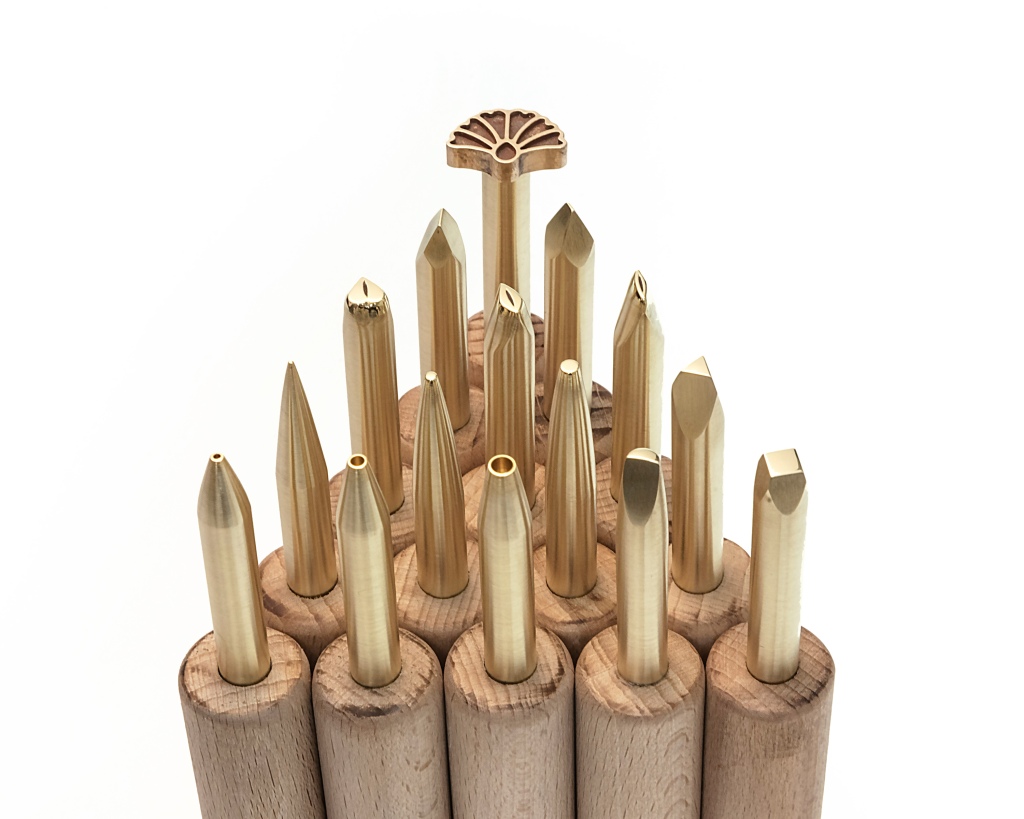
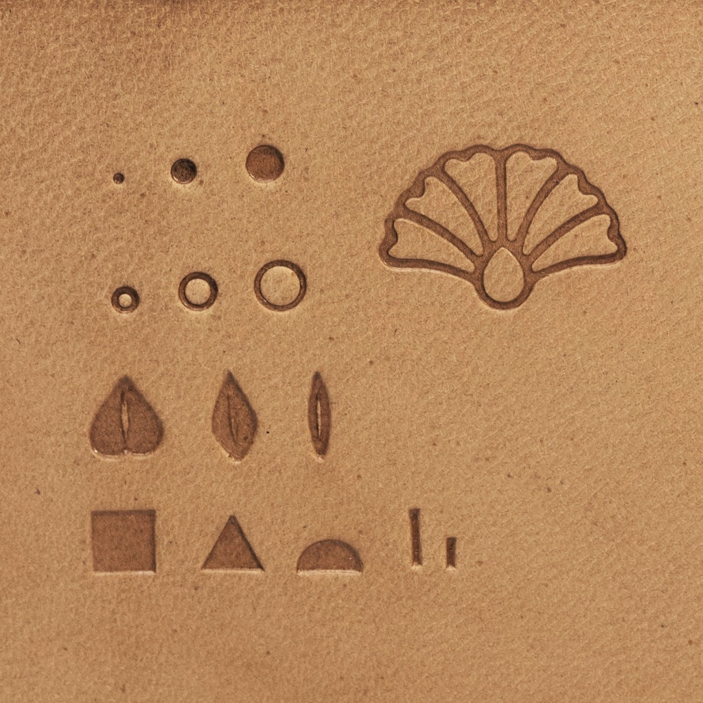
The Starter set is aimed at the bookbinders and hobbyists who are new to tooling and just starting their collection. It includes 15 different tools that can be used to create an infinite variety of designs, from simple to very complex ones, on its own or in combination with other brass handtools.
Tools included in the Starter set: – 3 dots in 1mm, 2mm and 3mm diameter – 3 circles with an inner diameter of 1,2 and 3mm and an outer/total diameter of 2,3 and 4mm. – 3 geometric shapes (square, triangle and hemisphere with 5mm sides) – 3 different leaves – 2 straight lines 2mm and 4mm long and 0.5mm thick – 1 Lotus flower
Below you can see examples of 3 designs made by Nate McCall using this set, from beginner to advanced.
How do I order? α) Just sent me an email at koutsipetsidis@gmail.com or leave a comment here. (Support small businesses by shopping directly from them!) b) Or head over to my ETSY SHOP.
Circles/rings and especially Dots are among the humblest of decorative tools binders can use to adorn their bindings and yet among the most useful. Regardless of whether you are making a design or period-style binding, dots and circles can be used in combination with traditional decorative tools or to create entire decorations on their own.
DOTS
I offer two sets of dot tools:
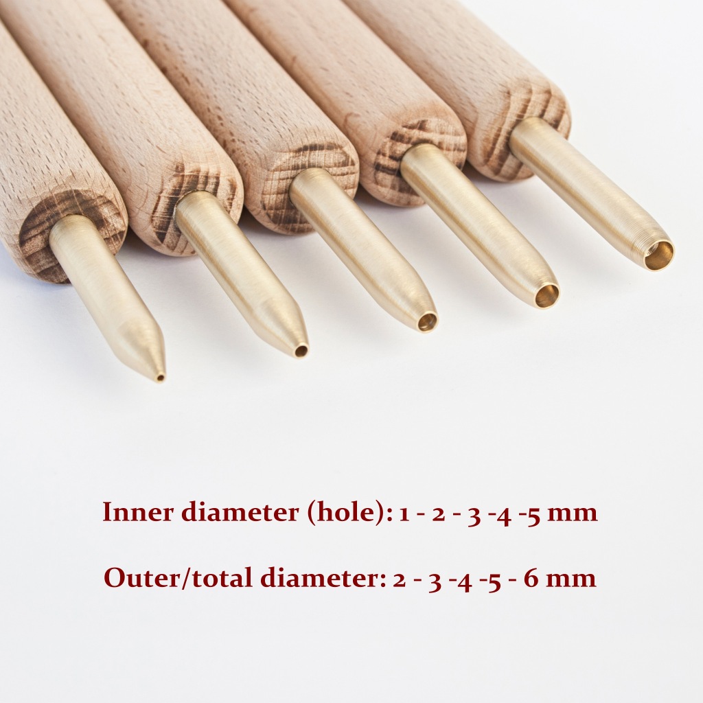
Large Set (10 tools) from 1 to 10mm in diameter. Available for 180 euros.
Small Set (5 tools) from 1 to 5mm in diameter. Available for 100 euros.
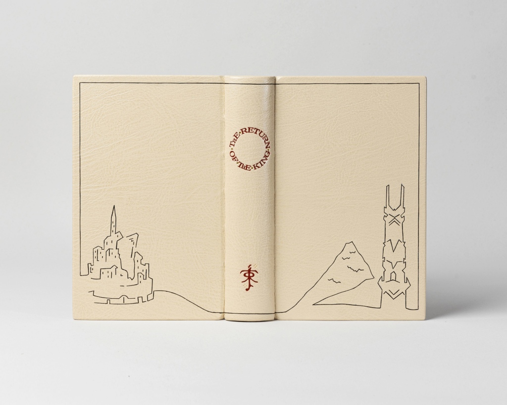
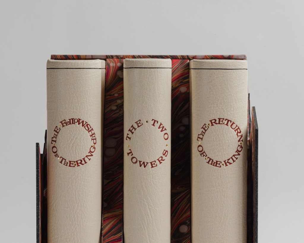
Ρresenting Tolkien’s Lord of the Rings. This is my last and biggest collaboration with Mia Heath from the summer of 2022. An epic bookbinding project for one of the most wonderful stories ever written.
Getting Lost in Middle Earth
I read Lord of the Rings back in early high school, right after the Hobbit. I’ve described the latter’s impact on me in the corresponding post, so I’ll just quickly say that LOTR’s beauty, scale and depth completely absorbed me.
I was exceptionally lucky because by the time I finished the books the films started coming out. Nothing like them had come before and -I dare say- ever since. Those who haven’t had the chance to watch them in cinema for the first time have no idea what kind of experience they’ve missed.
Miss K. originally commissioned me to bind the trilogy as a unique gift to her husband on whom Tolkien’s works have also had a significant impact. The Hobbit was actually commissioned after the trilogy, but since it would be finished first her devious plan was to use it as a diversion so that he would be completely unsuspecting there was more to come…!
Binding the Trilogy
Designing LOTR
Lord of the Rings is an epic saga. It deals with a lot of complex themes regarding war and its impact on those caught in it, the value of life, inner struggle, pain and enduring it, forgiveness, friendship, good vs evil, all in a way that is far more intricate and meaningful than it is usually given credit for. With these in mind I felt the bindings should be respectful, solemn in a way. They should look and be well-made, beautiful, but not in a way that draws the attention on them and away from the story. This led to an aesthetic that is in contrast with the pictorial and whimsical decoration of our binding for the Hobbit, thus reflecting the difference between those two stories.
The design is Mia’s work, who came up with it and also did the drawing I later used in tooling the decorations. The idea behind it was to show important locations found in each book, drawn using only a single, uninterrupted line (with the exception of few decorative details), an allusion to the fellowship’s journey.
Some of the locations were pretty straightforward, while others proved quite challenging, with Hobbiton being the most difficult. The final designs are elegant and imposing, while their minimalism compliments the wonderful texture of the leather.
“In the fires of Mount Doom…” – Decorating the Edges
Although the Hobbit was finished first as a binding its edge painting was actually meant as a practice for the more challenging one intended for LOTR. The idea was that it should fool the eye just enough so as to be perceived as a continuation of the marbled papers -and vice versa- upon a hasty glance.
By the time we got to do the edge paintings for LOTR we had the process down fairly well. I would prepare the book blocks by sanding them to a very smooth finish and then Mia would do the painting. She did many tests on books I keep around for this purpose and after a while managed to get the result as close to the marbled papers as possible, producing these impressive edges.
It couldn’t have been achieved without the help of Glenn Malkin who has made an excellent video illustrating this technique and also kindly answered some extra questions we had. Make sure to check his channel as he has quite a few instructional videos that I’m sure binders of any level will find interesting.
Maps, Titles and Rings
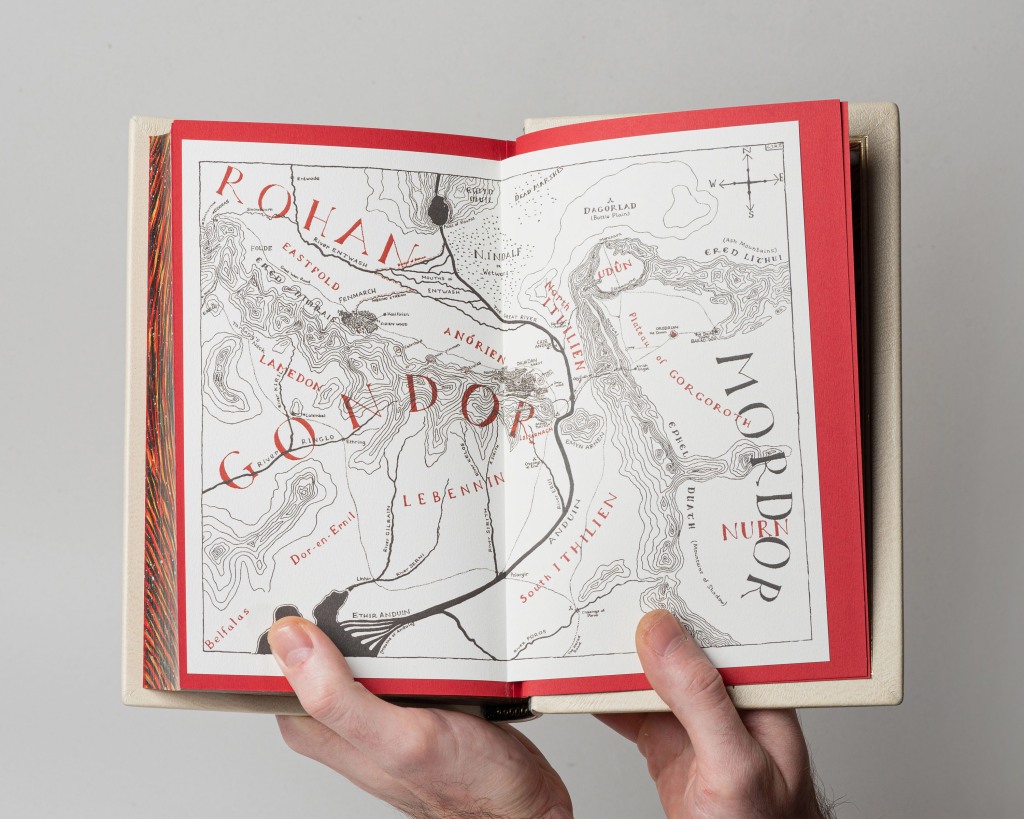
Maps The maps in the original edition were printed as the endpapers which prohibits their re-use, so new ones had to be made. As in the Hobbit’s case, I had them printed on an expensive cotton paper that can be found only in one place in Athens, which happens to be very far away from the bindery. But it was worth the trouble as I wanted the maps to feel as real as possible, to have texture and be exciting to look at.
Round Titles – Again! If you’ve been following my work then you’ll know by now my fondness for round titles, which I consider one of my trademarks. As such it was a no brainer to do round titles for LOTR, One Ring and all…
This however, as is the case with many other elements, posed a challenge. I’ll get a bit technical but bear with me as you might appreciate how even the smallest detail of a binding may often require problem solving.
The difference in length between the titles (with the 1st and 3rd book having rather long ones in contrast to the 2nd) created an issue concerning the lay out. The circle of the titles should be the same for all 3 books and at the same time it should look right on the thinnest spine, that of the second volume. After quite a bit of experimentation, which involved laying the longer title over many different sized circles, I found the optimum radius.
This then led to another issue: type size. I either had to use very small letters, so that the titles of the 1st and 3rd volume would fit within the circle but would also make the title for the 2nd volume appear tiny and ridiculously sparse, or use a “normal” size, with the second volume’s title looking ok and the other two unable to fit.
To solve this I condensed the 1st and 3rd volume’s title as much as I could, also using dots instead of gaps between words to save even more space. It wasn’t enough though, so I turned to a trick I’ve seen in old bindings, which is to use much smaller type for certain letters, snugged in the gaps left between or under the larger type.
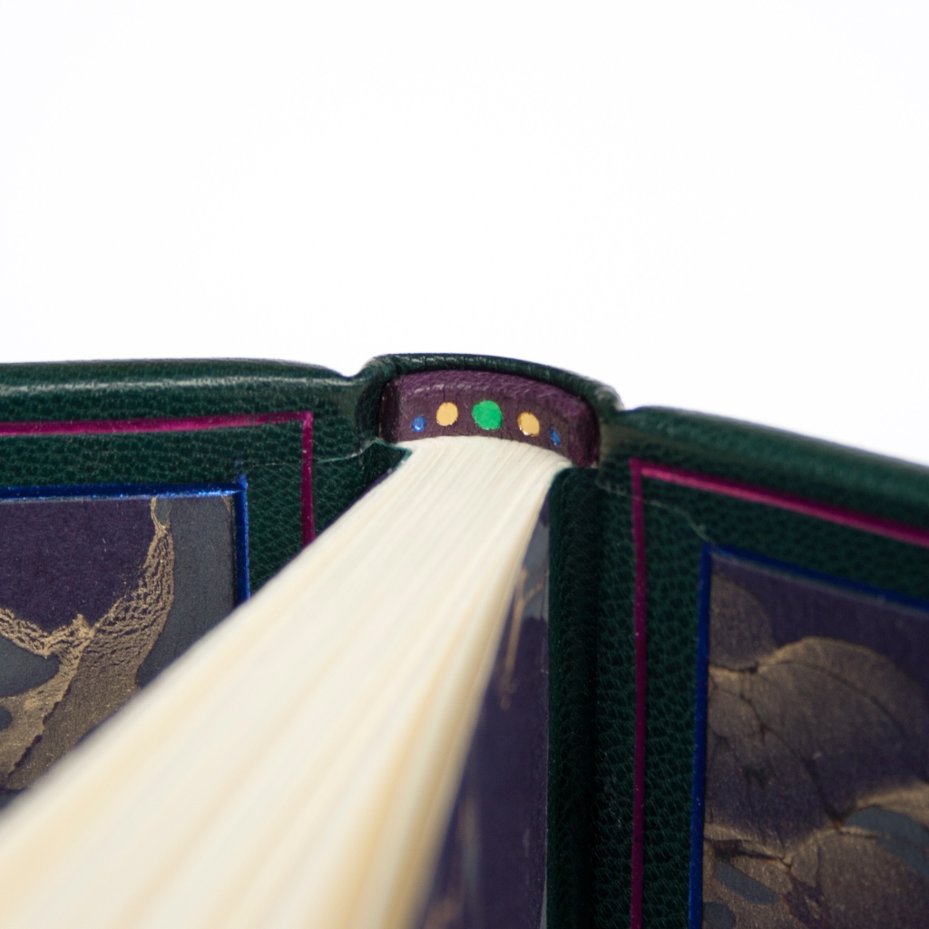
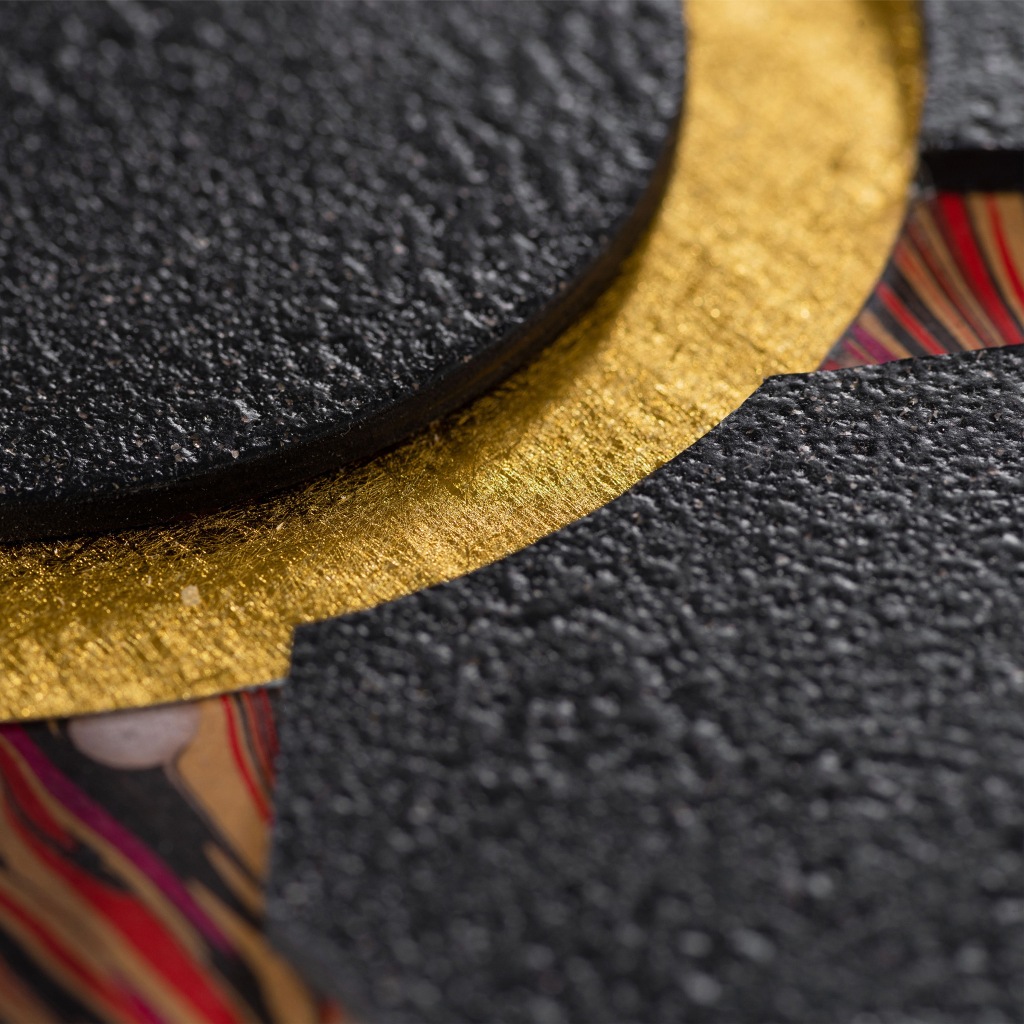
More Rings… Doing handsewn endbands is always on the table, as they’re classy, neat and look beautiful, but I find myself opting less and less for them in recent years. In this case they would create too much extra visual noise and would hardly be noticed between the colorful edges and marbled papers.
Instead, I made these from a lustrous black leather. The 9 rings are either a reference to the members of the fellowship or represent the rings given to the kings of men, who above all else desire power – as everyone knows…
Mount Doom and the One Ring – A Bookcase to rule them All
The bookcase deserves its own section in this post. It’s arguably the most complex bookbinding structure I’ve ever attempted and one that was a true nightmare to make.
I really wanted to push the envelope and create a unique display for the LOTR bindings. A case that wouldn’t simply be a nice looking protective shell but something that could stand out on its own. Something impressive and unique, that would intrigue the viewer’s eye and invite exploration through its texture and vivid colors.
Several different ideas and structures were discussed for a long time, going back and forth between simpler and more intricate ones. At some point the project was overdue and Christmas (oh, did I mention it was intended as a Christmas gift?) was growing ever nearer so by the end I suggested we settle for a much simpler structure from the options discussed up to that point.
But it bugged me. It didn’t feel bold enough, befitting the scale of LOTR or its importance in my heart. I pitched the idea for a case representing the One Ring being forged at the fires of Mount Doom, without having much to share with Miss K. apart from a vague but full of excitement description. To my delight she was intrigued and trusted me to move forward.
Here’s a comparison to give you just a hint of how complex this was… A regular book slipcase has 5 parts. A clamshell, which is quite more complex as a structure and requires precision down to half a milimeter to all its pieces, is comprised of 9 parts. Well, my case for LOTR has … 38!
Trying to plan, cut, cover and join all of these irregular pieces caused me headaches for days on end – not even joking. By the end I was exhausted but, much like Frodo, I had successfully taken the Ring to Mount Doom…
The marvelous marbled papers representing the lava-filled chasms of Mount Doom are, once more, made by the perfection-seeking Daniela from Papiers Prina.
Photoshoot and editing was done by Maria Siorba. She really managed to captivate and showcase the beauty, texture and intricate details of this project.
Last but not least I would like to make an honorable mention to the Greek Tolkien Society, the Prancing Pony, which were most helpful in providing me with lots of information for the originally planned designs. They didn’t make the final cut but their help and support is much appreciated.
Mister C, the patron saint of Greek bookbinders, graced my bindery a while back with a commission involving a beautiful 2-section book from Incline Press titled “Minerva, Mantone and Circes”. He only provided one guideline: to base the design around the title’s initials.
This is one of the bindings done in collaboration with Mia Heath. The creative freedom granted by Mister C. and the peculiarity of the book definitely invited some experimentation, so we stepped out of our bookbinding comfort zones and tried new things.
Work was divided as follows: I would do the forwarding (binding the book/structure) while Mia would do the finishing (design/tooling the decoration).
Forwarding: The book was simply too thin for any of the standard structures so I came up with this stub binding / clamshell box hybrid. I sewed the sections onto a sheet folded like an accordion and then attached that onto a core similar to the ones often used to create a curved spine in book cases/boxes. I also chose to incorporate the book’s original covers in 2 flaps, also doubling as endpapers, made of a vivid yellow striped paper which complemented the unusual color of the pages.
Finishing: Mia came up with the design and tooled it. The border motifs were inspired by traditional decorations, which fit well with the book’s content and also with Mister C’s preference for a more classical style. However, the twist lies in the main design, which at first glance might seem to be extra flourishes but instead makes unconventional use of standard decorative tools to create the lower half of a female body. Can you spot the three initials?
Finally, I felt like the book needed some kind of enclosure to protect but also underline its luxurious feel but couldn’t see it a regular slipcase. The idea of a pouch came up and went for a lustrous golden satin fabric, which makes it feel as if you are undressing the book.
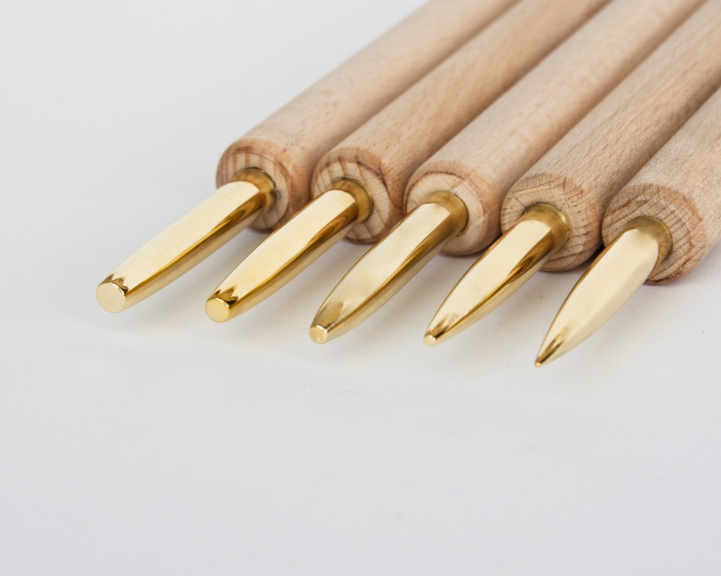
The idea to make the Brass Band Sticks originated from a fellow bookbinder who had muscle strain after decades of work, telling me she had trouble using band nippers due to the hand pressure required. Band sticks immediately came to mind.
Wooden band sticks have been around for a very long time. They’re an easy to make tool that helps form the leather around raised spine bands.
However they have some significant drawbacks. Wood contains natural oils which are in some cases likely to stain leather. The groove can widen through continuous use, eventually rendering the band stick useless. Most importantly though, it loses its smoothness and as a result the edges become coarse and eventually produce splinters which will scar leather.
Enter the Brass Band Stick
Enter the Made from a bookbinder for bookbinders, the Brass Band Stick is an updated version of the old-timey tool, one that is more robust, precise, friendly to leather and comfortable to use.
The Brass Band stick offers:
– A clean raised band As it will never stain leather, in contrast with wood.
– Smooth edges The edges are carefully finished by hand to be smooth enough to produce a great result, but not polished, so the tool retains some necessary grip over the leather to help form the leather crisply over the spine band. And of course, it will never become coarse or scar your binding.
– A lifetime of precision As brass is a material far more robust than wood, the groove will retain its width through a lifetime of use and produce a neat result each and every time.
Comparison with Band Nippers
Band Nippers work for all sizes, so why should you prefer the Band Sticks? Each tool has its strengths. Band Nippers work for any raised band width but require adjusting, applying pressure constantly and cost more due to their complexity. Band Sticks are easier to use, have a fixed width which allows repeatable precision and cost less. In the end it comes down to preference and way of working.
The Brass Band sticks are ideal for:
– Big binderies with high volume of work. – Bookbinding projects that involve doing a number of identical books on a regular basis. – Binders or bookbinding enthusiasts that have tendinitis or reduced hand strength (injury or age related) and have trouble using band nippers. – Anyone preferring the ease of use this tool offers!
The tool comes on a comfortable wooden handle, smoothly finished with oil and wax.
Current available groove widths are: 4mm, 5mm, 6mm and 7mm. The groove has a depth of 5mm. Custom sizes available upon request. Please take the leather’s thickness around the band into account as well when deciding which width you want!
Pricelist: – 70 euros for one Brass Band Stick. – 130 euros for a pair. – 250 for all four.
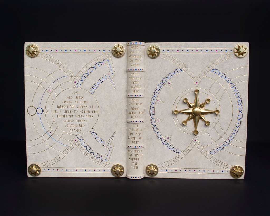
This new set of tools will allow you to decorate your bindings and leather projects with runes, for example Futhark, Tolkien’s Angerthas or your own runic alphabet.
For what’s more it can be used to created all sorts of linear designs.
The Aethra Codex is a great example of a binding I’ve made using such a set.
The runic set includes 4 line tools that can be used hot or cold. You can blind tool (just the tool impression) or use them in combination with stamping foils.
Line dimensions: 8, 6, 4 and 2 mm. All are approximately 0,5mm in thickness.
PRICE – 100 euros
+ packaging and tracked shipping + transaction fees + in currency conversion fee (if required)
How do I order? α) Just sent me an email at koutsipetsidis@gmail.com or leave a comment here. (Support small businesses by shopping directly from them!) b) Or head over to my ETSY SHOP.